In what ways does your media product use, develop or challenge forms and conventions of real media products?
Forms and Conventions of a general Acoustic/Folk music video.
-Playing an instrument
-Simple- not too much make-up (subtle/natural)
-Subtle colours and pastoral settings
-Serious relationships- older actors
-Unique style of fashion/make-up
-Locations tend to be isolated places. Or a location that reminds the artist of who they're singing about.
-Slow paced camera movements/editing
-Naturalistic setting
-Close ups- establishes the artist and shows their importance in the video
Forms and Conventions used, challenged or developed in our music video.
Playing an instrument: This was a form and convention that myself and my group challenged during the music video. This is because throughout the music video the artist Jessica wasn't seen in the shots and locations with any instruments however we wanted to create a unique music video and not to portray the obvious. But we had trust in that the audience would understand through the music that an acoustic style instrument would have been used.
Simple- not too much make-up (subtle/natural): This is a convention we used in our music video. We wanted my artist Jessica to look very natural and not to have over the top, extravagant make-up. I felt it was necessary that she had a natural look so that she could link in with the location of the music video which was heavily influenced by nature and natural settings.
Unique style of fashion/make-up: This was also a convention that we again used in my video. Although we decided that our artist would have very subtle make-up we wanted her style in clothing to be unique and quite quirky although nothing too extreme something that portrayed her everyday comfortable style. Therefore in the video Jessica wore black velvet leggins with doc martins and a karky jacket. I felt this give a slightly indie look to her and complimented well with the subtle/natural make-up.
Subtle colours and pastoral settings: This was a convention that was developed. There was a lot of autumn colours in my musicvideo due to the fact filming was done during that season but gave the video an extremely nice effect. The colours suggest a soft and subtle feel to the video. This matches with what was trying to be aimed in the artists image as we wanted her to have a link with the location.
Serious Relationships- older actors?: This was a convention that was used during the video. Although the actors weren't an older couple in terms of people the age of around 20, they were still old enough to portray this serious relationship in the video. When choosing the actors i knew that these people were very mature and that from their image they look slightly older than they actually are. I felt this slightly younger age of the couple worked well with the song as the suggestion of uncertainty in the relationship hints a slightly younger vibe.

Locations tend to be isolated places. Or a location that reminds the artist of who they're singing about: This was a convention which was used during my music video. The locations were extremely representative of the artist signing about a specific person or for example relationship. In the music video there was an obvious location which the artist sung in but also the details of the couple and there relationship was aslo in this location. Some of the shots show Jessica the artist singing in a certain part in the location and then there is another shot with the actors in the exact same part of the location. This is representative of a reminisant feeling in the shots which also links with the lyrics of the music.
Naturalistic setting: This is a convention that is used in our music video. The setting and location in our music video provides the audience with a naturalistic setting that they could relate to being in. This also applies to our couple being in this setting and therefore it shows the naturalistic way the couple get on in their relationship in the setting and that this idea is something that is relatable for the audience. We decided to use this setting so that our audience could feel comfortable watching the music video with the surroundings we incorporated into the music video.
Slow paced camera movements and editing: During the music video this was a convention that was used. Whilst filming, alot of slow panning shots were used to create a soft movement from one image to another. We also used a slow sweeping shot to match with the flow of the music and lyrics. In the editing side of the music video we used slow, dissolving transitions to move the sotry along nicely for the audience. This so that they could get to grip with the story with enough time and pace. It also reinforced the relationship of the couple for example one shot was put into slow motion of the couple having fun and spinning around hugging. This showed a fun, loving part of their relationship in the story.
Close ups- establishes the artist and shows their importance in the video: This was also a convention that was used in our music video. We had a number of shots of our artist singing but a lot of them were close-ups of her so that the audience could establish her as the artist in the video and to understand the lyrics of the music. It also allows the audience to see the artists emotions towards the song and story that is being told within.
Ancillary Texts: Forms and Conventions used in my digipak and advert-
- Forms and conventions that are used in a digipak/advert of an acoustic/folk singer/band typically use a rural, rustic outdoor setting. This is a form and convention i have used in my digipak but not as clearly used in my advert. On the front cover of my digipak i have used pictures of an urbanized outdoor setting with suggestive colours and light of a rural rustic setting. And this applies to my advert also. The picture in my advert in located inside but suggests my artist is looking out of the window at the rural outdoor settings. The light from the window which was enhanced through brightening effects also suggests these settings.

 - Forms and conventions of a general digipak of any genre include barcodes so that they are suitable for retail and they also display record labels to promote these labels to the public. These are two conventions i have used in my digipak and also in my advert. The barcode on the back of my digipak shows the buyer that it is being retailed properly and the use of the record label used on my advert is a way of identification for my artist and her album and also relates the audience back to the digipak as the record label is also visible on there as well.
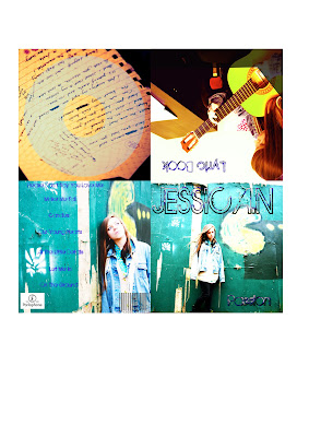
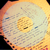
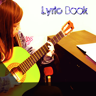 -Forms and conventions that are used in a digipak/advert of an acoustic/folk singer can also typically involve the use of instruments. This is convention of a form i have used in both my digipak and advert. Although in our music video no instruments were used or seen, we felt that we were able to trust our audience to understand that there was acoustic instruments used in the music. But to emphasise the use of these instruments i decided to include them in my digipak and advert. On the lyric book of my digipak i used a picture of my artist playing an acoustic guitar and my second inside cover was of written lyrics. I felt this portrayed and emphasised the acoustic instrument sounds used in the music video. I also used this convention in my digipak by involving the guitar in the background of the advert so that people could understand when seeing this advert that my artist played this instrument and that her music may take the form of an acoustic genre.
 Another Internet based technology which became the exact reason why I and my group were actually able to create our music video was through Email. We had decided on using an artist we were friendly with and had easy contact with through phones but this artist ended up being extremely unreliable and not bothered so we went on a hunt for another artist, as a group we knew about an artist that hadn’t quite reached famous levels with her music but was well known through YouTube. We were able to get hold of her managers email and therefore I emailed him asking whether it was possible we were able to use on of the artist songs to base our Media music video around. He replied to us in a very reasonable amount of time saying it was absolutely fine. This was a great turning point in our planning process as we were then able to get on with creating ideas and themes. Another technology which I felt was also another huge aid in this project was YouTube. It gave me chance to research and look at all sorts of different music videos and how they had been put together. It was also useful when searching for specific artists of a specific genre.

 And lastly the use of the media technology of Final Cut Express. I had already been extremely familiar with Final Cut Express from last year’s project. This year we learnt how to lip sync our videos with Final Cut Express. This specific task I firstly didn’t entirely get to grips with so therefore I felt I wasn’t able to complete editing of the lip syncing in massive parts. But speaking with my group we understood that one group member felt she was very comfortable with how to do this process and agreed with me and our other group member that she would do bigger parts and me and my other group member would watch over and complete smaller parts to this task. This was also slightly the same with the editing part, although I was able to remember a lot more from last years project using Final Cut Express and was able to complete some editing tasks when either one or both group members were not in to do so. I was slightly more creative than last year using Final Cut Express and learnt how to put in different effects and fades and dissolves into our piece which really enhanced the shots. I and my group also had a huge amount of footage so being able to cut clips with just one button made the whole process much more efficient and speedy.


